Scatter Plot Calculator
In the age of data, a scatter plot maker is invaluable in helping you understand the world. As always, Omni has your back; we have created a scatter plot maker that will help you visualize any dataset you have.
We will show you how to find correlations, how to read a scatter plot, and how to create your own. Let's learn the skills we need to understand the world we live in and pass your next math exam.
What is a scatter plot graph? Re-thinking the scatter plot definition
First things first; what is a scatter plot graph? This one is straightforward. It is a collection of points represented in 2D space. In more familiar words: it's the simplest way to visualize data objectively. Because a scatter plot is generally 2D (it could be 3D as well, but that is less common), it is handy for revealing correlations between two factors.
For example, if we record the money we have at different days throughout the month, we will see something like this:
And:
which looks like just some boring, useless data. However, if you create a scatter plot with the data, you can see much more than you thought. You don't need to know much about how to read a scatter plot to realize that over time my money decreases (hopefully because we bought nice things).
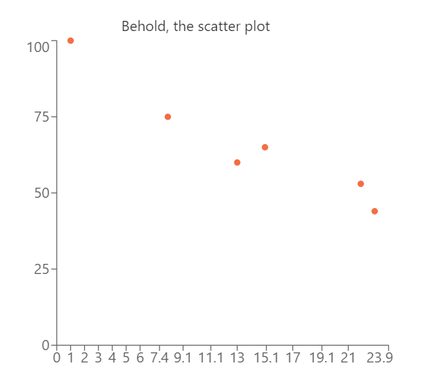
Not only can you see that faster with this scatter plot example, but you can immediately see that the only moment we made money was an outlier and not part of the real trend. We will go back to this scatter plot example later when we talk about correlation coefficients, linear regression, and learn more about how to read a scatter plot.
For now, all you need to understand is how much easier it is to spot trends, outliers, and get a sense of the underlying relation between variables using a scatter plot. And remember, this is an example with 6 data points, in real-life datasets you can easily have hundreds of points or more, so good luck understanding anything looking at only the raw numbers.
So now we understand what is a scatter plot graph, and also the value they have. It is now time to create a scatter plot on our own. No, not by hand, that's a lot of unnecessary work; we will be using Omni's scatter plot calculator.
How to make a scatter plot using Omni's Scatter plot calculator
How to make a scatter plot? Using Omni's scatter plot calculator is very simple. You just need to take your data, decide which variable will be the X-variable and which one will be the Y-variable, and simply type the data points into the calculator's fields. Unless you want to analyze your data, the order you input the variables in doesn't really matter.
Just remember that the scatter plot chart graph gets updated with every new input (you need to input the full x-y pair) but it only starts showing values after the second input, as it's not useful to create a scatter plot one piece of data, to be honest. Now, once you have inputted all your data, the scatter plot calculator shows you your cloud of data-points. That wasn't hard, was it?
You might be wondering if you should learn how to create a scatter plot by hand, and we would argue against it. It is much more important to answer the questions that come after you make a scatter plot: what does that mean? I don't know how to read a scatter plot. What information is it showing me?
Do not worry. We told you that we have your back at Omni, and we do. Let's look at some scatter plot examples and learn how to interpret the results from our scatter plot maker.
How to read a scatter plot — Examples
We've gotta be honest with you; if you want to truly learn how to read a scatter plot in the most efficient way, you will need to learn math. But, before we do that, we can learn a lot about the data by merely looking at it and thinking about it. Let us show you the following scatter plot example. Consider this to be a more realistic version of the first scatter plot example we saw.
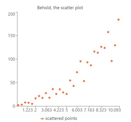
Here, we have 30 variables that don't seem to have any relationship, but if we plot them, we can clearly see that we are dealing with a linear scatter plot with some noise. This noise is what we call any deviation from the underlying trend. We can define this trend mathematically, but, as humans, we've evolved to be great at spotting patterns and relationships, , so we can do a lot without formal analysis.
The important things to master when learning how to read a scatter plot are variable choice, trend-spotting, and knowing the difference between correlation and causation. Variable choice is simple but tricky. As we said before, it's only significant for mathematical analysis of the data. Still, in general, you want to have the independent variable on the x-axis and the dependent one on the y-axis.
The quickest way to identify which is which is to think about the cause-effect situation. In such a situation, the "cause" is the independent variable and therefore goes on the x-axis. The "effect" goes on the y-axis because it is the dependent variable. This is not a hard rule, and things might look different depending on how you design the experiment or what you want to figure out, but it's a good starting place.
Spotting trends is the easiest part because it's part of what defines us as humans. Just by looking at the data in a scatter plot, the correlation should be apparent. If it isn't, you will need to do some scatter plot correlation analysiswhich is a bit more complicated and also shares a lot in common with the last part: correlation vs causation.
Scatter plot correlation and linear scatter plots
So the correlation between two variables is defined mathematically and measures how strongly related the two variables (or more)are. One of the biggest misconceptions is that a strong correlation means that one variable causes the other, but that is incorrect. Sometimes, there is an intermediate variable that acts as a causal link between both variables and sometimes, there is absolutely no .
The important thing to remember is that, like most mathematical tools, correlation doesn't tell us anything about real-world connections; it just speaks of how similarly two variables change. Provided you have designed a sensible experiment, it is fair to assume that strongly correlated variables are connected somehow. However, what link or type of connection exists is not something you can be sure of by simply looking at the scatter plot or the correlation values.
But let's say you've used the scatter plot maker, and you got what seems to be a linear scatter plot. What does this mean? How do I know it is actually a linear scatter plot and not some other type? Simple! Well, not so simple, but at least easy if you have the right tools. Let me briefly guide you through the process.
- Make sure, visually, that it looks like a line. The more points you have, the better.
- Analysis of the scatter plot: with the least squares regression line calculator you can get the mathematical parameters you need.
- Make sure the errors in the slope and intercept are small.
- Make sure that the Pearson correlation coefficient is close to its maximum value of 1.
If all these tests are positive, you can be pretty confident that you have a linear scatter plot. That's great news because you can use our rise over run calculator to learn more about the trend line, or you can predict other pairs of values using our linear interpolation calculator.
Otherwise, you will need to expand your search to other types of correlation. Conveniently we have the necessary tools for you at Omni! (As we told you, we DO have your back!) Here are some examples:
- Exponential scatter plot: Use the exponential regression calculator; and
- Quadratic scatter plot: Use the quadratic regression calculator.
Sometimes, however, you might be interested in knowing more about your data set but are not interested in how each data point is related to one other, especially if you have a set of 1D points. In such cases, we recommend looking at our other tools: the dot plot calculator and the histogram calculator.