A histogram calculator should answer the question "How to make a histogram?" with a very loud "Easily" at the very least. But a truly amazing histogram maker should go beyond and also give answers to "What is a histogram?", "What is the difference between a histogram vs a bar graph?" while keeping you entertained and teaching you about the applications of histograms in classical probability and the intricacies of a right/left skewed histogram. So, is this a truly amazing histogram calculator? That is for you to judge.
How to make a histogram using the histogram calculator
If you are here, chances are you just want to make a histogram, and you already know what a histogram is and how it is defined. So, let's not waste your precious time and get right to it.
The histogram calculator is composed of two sections: the data and the histogram or bar chart itself. We can explain the differences between those two later - for now, let's focus on the histogram-making part.
Starting with the field name #1, fill each field with one of your data points. New fields will appear as needed, and the histogram is updated with every new data point.
The scale and limits of each bin in the graph get automatically adjusted based on your input, always keeping ten bins and all data points visible. If you wish to control the way the bar graph looks, you can do so by selecting the checkbox Adjust chart parameters below.
While this is all well and good as far as theoretical knowledge is concerned, what about its practical use? Just in case you are still unsure about how to use the histogram calculator, let's take a look at a histogram example.
A quick histogram example using this histogram maker
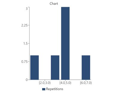
To avoid overcomplicating this histogram example with too many data points, let's only use 6 points in our histogram-making showcase. Let's say my data points reflect the outcomes of a dice roll repeated 6 times. The results were: 1,4,3,6,4,4.
This is the step-by-step process to create our example histogram:
- Turn to the histogram calculator and input the number 1 into the field labeled #1.
- Input the number 4 into the field labeled #2. A new field will appear labeled #3.
- Keep introducing your data points until you reach #6, which should correspond to our last 4.
- You should see a histogram. We can edit it to look better.
- Select "Adjust chart parameters" below the bar graph.
- For this histogram example, we recommend using:
Minimum value shown = 1,Maximum value show = 7,Bin Width = 1which should result inNumber of bins = 6. - Now you should get a histogram similar to the one shown above.
- Now go ahead and input your own data and see how cool you can make it look!
🙋 Are you interested in seeing the odds of rolling a particular dice value? The dice probability calculator has got you covered, even if you use dice with 20 faces!
In this example, we have plotted the result of several probabilistic tests (rolling dice). If we had a huge amount of tests (infinite, to be pedantically precise), the results would reproduce a probability distribution. This can be very useful for analyzing patterns and making predictions, as we will see later.
However, by now, you probably have more questions than answers, and that has to change. So let's dive a bit deeper into the histogram definition, how to compare histograms vs. bar charts, and how we can use histograms to understand distributions like the bell curve and more.
What is a histogram? Histogram definition and example
A histogram is a way to represent data by the frequency with which an event occurs rather than the moment they happen. You can see that the frequency distribution calculator represents the data as a histogram, for example.
Coming back to our histogram example of the dice roll, a histogram tells us how many times each number appeared, but it doesn't tell us anything about when a roll happened or which number came before and after. This is ideal when we can assume each even to be independent of each other (like when rolling dice or during a lottery draw).
Now we have answered the first question, "What is a histogram?", but we don't yet know what makes a histogram look like one.
In a histogram, the height of each bar in the chart represents the number of times such an event happened, while the x-axis tells us what that event is. Most commonly, the x-axis is represented by numbers (or some quality that can be ordered).
One of the most important things that makes a histogram what it is is the fact that the x-values are not continuous (even if they could be in the data), but they are discretized by grouping them into bins that represent a specific range of x-values.
So far, we've mentioned histograms and bar graphs almost interchangeably, and this leads us to the direct comparison of histogram vs. bar charts or bar graphs. So, what are the differences/similarities between a histogram vs. a bar graph?
Differences between a histogram vs. bar chart/graph
Given that you already know how to make a histogram, and that we've already gone through the histogram definition together, it should not surprise you to find out that a histogram is a bar chart - a special type of bar chart.
If we want to compare a histogram vs. a bar chart, we need to look at histograms as a small subset of all possible bar charts. Such a subset is the compilation of all bar charts in which we have the number of events in a particular range/category plotted in the y-axis, leaving the x-axis to organize said ranges.
In a bar graph, however, each bar's height can represent any quantity, and the x-axis can be any field we want, not necessarily a range or category. The confusion between histograms vs. bar graphs often comes from the fact that they look very similar (they are both bar charts after all), and they are both used to represent non-continuous data.
However, a subtle (but clear) difference between a histogram vs. a regular bar chart is that a histogram represents frequency of occurrence. Histograms tend to have ordered x-axis, as they typically represent a range of values. So you can think about the dilemma of histograms vs. bar charts by remembering that histograms are bar charts of frequency.
If you want to quickly spot a histogram vs. a bar graph at a glance, you can look at their shapes. Bar charts typically have freedom in the way they arrange their "ranges" or "categories", while histograms don't. So, if you see a graph with well-ordered bars going from biggest to smallest, or the other way around, it is most likely a bar chart...
... unless they are extremely left-skewed histograms (or right-skewed histograms for that matter), then it gets tricky, but also very interesting.
Left/right skewed histogram and statistical distributions
And so, it's only fair that we explain what left-skewed histograms and right-skewed histograms are now. As the name suggests, these are histograms whose data is heavily skewed to the left or right edges of the graph. There can be many reasons for this, so let's look at them.

The first reason is randomness, or not having "enough" data to represent the true relationships between variables. Imagine, for example, that the dice results from our previous histogram example were: 5, 2, 6, 6, 5, and 6, something not totally unreasonable. In this case, we would have a right-skewed histogram as the tallest bars would be on that side of the chart.
A second reason for skewness is that the actual probability distribution is truly skewed right or left. Typical distributions, such as the normal distribution or the Poisson distribution, tend to be symmetrical around their most frequent value. However, there are distributions such as the Boltzmann distribution (used in physics to describe the temperature of a black body) which are skewed to one side or the other, creating a left-skewed histogram or a right-skewed histogram.
Another potential reason is user error, experimental design error, or other similar limitations of the experiments performed. For example, a Poisson distribution is symmetrical only if the values on both sides of the mean are equally allowed. That's why when you center such a distribution close to zero without allowing for negative values, you end up with a left-skewed histogram.
The takeaway, if you should only remember one thing
So, what, if anything, should you take away from all this text you've (hopefully) read? If you could only remember one thing, it should be a good understanding of what a histogram is. A histogram is a collection of data points shown in a bar chart representing the range (or category) of the event and the frequency (or the total number of events) in that range.
But, if you could just make a small effort and learn something else, even if you don't remember it perfectly, it should be what makes a histogram have the shape it does. And that is the underlying statistical distribution of the events measured, be it a binomial distribution, an exponential distribution, or some other non-symmetrical shape.
Ultimately, we hope that this calculator helps you understand, use, and make histograms. This world is full of histograms, bar charts, and all kinds of statistics, and being able to understand and analyze them will help you in your everyday life, even if it's just to improve your odds of being successful!