Dot Plot Calculator
The dot plot calculator will help you make your own dot plots and obtain a statistical analysis of them. This tool is the perfect dot plot maker if you're looking to quickly visualize data in a dot plot.
Here, we will teach you how to make a dot plot and what dot plots are best used for. We will also cover:
- How to find the mean in a dot plot;
- How to find the median in a dot plot
- How to find the mode in a dot plot;
- How to find the range in a dot plot;
- What a cluster is in a dot plot; and more.
Let's start!
What is a dot plot?
A dot plot is a visual representation of data in the form of dots stacked on top of each other. Generally, one dot represents one occurrence of a quantitative property of a value, such as frequency of appearance within a data set.
What is a dot plot best used for?
Dot plots are best used for small sets of data. Since the idea behind using a dot plot is to easily visualize a data set using nothing but dots and labels, increasing the number of either would make differentiating between two dots more difficult.
For example, this dot plot calculator or dot plot maker only allows up to 20 different value-count pairs, and each value's count must not exceed the number 20.
How to make a dot plot
Suppose a teacher would like to visualize the students' grades in a specific classroom (let's say, a 30-student classroom).
If we were to do that, we would need to first organize the data somehow. We could use either a table or just write down the number for each student's grade in an ordered way.
Let's use a table with the grade and occurrences of the students' grades and order it from highest to lowest (we can use either orientation as long as it's ordered).
A | B | C | D | F |
|---|---|---|---|---|
3 | 5 | 10 | 7 | 5 |
Now, to translate this into a dot plot, we just need to create five labels, one for each grade, and then pile up a number of dots equal to the frequency of each grade:
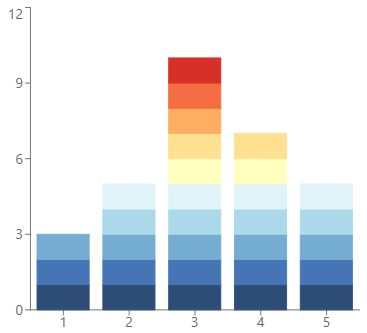
From this dot plot, we can immediately see the same information we had on the table and directly compare each grade to others in a precisely scaled way.
We will further analyze the dot plot in the sections below.
How to read a dot plot
When looking at a dot plot, we can classify it into four shapes:
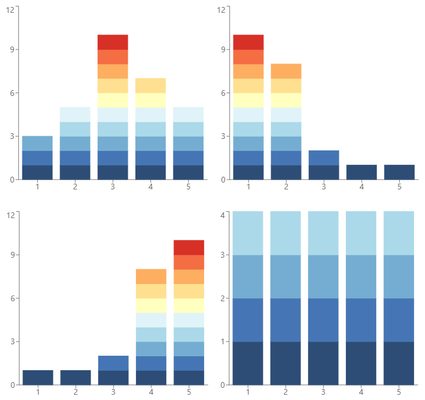
- Symmetric dot plot. Symmetric dot plots usually have a normal distribution of data with one or two center peaks and a lower amount of data on each side. Read more about this type of distribution in our normal distribution calculator.
- Right-skewed dot plot. A right-skewed dot plot will have a larger occurrence of data to the left of the graph while keeping smaller quantities to the right.
- Left-skewed dot plot. Similarly, a left-skewed dot plot will have the vast majority of data concentrated on the right and a lower amount of data on the left.
- Uniform. Lastly, uniform dot plots have their data equally distributed throughout the graph.
Let's now detail how to find the mean, median, mode, and range in a dot plot.
How do I find the mean in a dot plot?
To find the mean in a simple dot plot counting the frequencies of values:
- Multiply each value by their frequency/number of appearances. Do this for every value and add all the results.
- Divide this number by the total number of values; not the sum but how many different values are used.
- The result is the dot plot's mean or average.
How do I find the mode in a dot plot?
It is really simple to find the mode in a dot plot. Just follow these steps:
- Take a look at the dot plot. We're looking for the value that appears most often.
- Find the highest column or columns within the dot plot.
- The value related to that column is the mode of the dot plot. If there's more than one column with equal height (and greater than all others), every value associated with those columns is part of the mode.
How do you find the range in a dot plot?
To find the range in a dot plot:
- Find the maximum and minimum values. Not the column itself but the highest and lowest values.
- Subtract the minimum from the maximum value.
- The result is the range of the dot plot.
How do you find the median in a dot plot?
The median in a dot plot can be a bit tricky to find. But it's easy to do it following these steps:
- Arrange the dataset from lowest to highest.
- Determine if the dataset is even or odd. To do this, count the number of values first.
- The median is the value that splits the dataset into two equal parts. Count from lowest to highest to find it. If the dataset is odd, there will be only one median.
- Otherwise, if the dataset is even, there will be two values splitting the dataset. In this case, the median is the average between the two.
An example using the dot plot calculator
Let's further analyze the first example; teachers who want to make a dot plot to analyze their students' grades.
How can we input the data or do a statistical analysis when dealing with grade names (like A, B, C...) and not numbers? We replace the letters/names with numbers.
As long as the correspondence between them is appropriate, we can get precise results.
For example, we wouldn't use 1, 2, 10, 11, and 12 to represent the letters A, B, C, D, and F, since the spacing between them is not related to the proportion we use for grades. Here 0, 1, 2, 3, and 4 or 1, 2, 3, 4, and 5 would be more fitting.
🙋 Of course, this depends on context, and it's up to you to choose the correct way to translate the labels to numbers.
In the end, what the mean/median/mode number will tell us is its position in relation to those labels.
As we said, if we use 1, 2, 3, 4, and 5 to represent the grades:
1(A) | 2(B) | 3(C) | 4(D) | 5(F) |
|---|---|---|---|---|
3 | 5 | 10 | 7 | 5 |
And if we input their respective frequencies in the dot plot calculator we will get:
- Mean: 3.20;
- Median: 3.00; and
- Mode: [3].
Back to our table, we can see that the mean lies between positions 3 and 4, which would be between C and D, closer to C.
The median corresponds to the grade C.
And the mode is also the grade C.
That's it. Working with the dot plot calculator is really simple. Give it a try!
FAQ
What is a cluster in a dot plot?
A cluster in a dot plot is a group of dots that clearly distinguish between other values closer to them. There can be multiple clusters within a dot plot, and they can give us a quick insight into the dataset.
What's the difference between a histogram and a dot plot?
A dot plot represents individual data as individual points, while a histogram uses bars to represent data groups. Generally, dot plots are better suited for small amounts of data. In contrast, you can use a histogram for small or large datasets.
What is an outlier in a dot plot?
An outlier is a data point that is separated by a significant distance from other values. Often, these values contain specific information regarding either the data to be investigated or the data gathering process.
Input up to 20 value-count pairs and the chart will appear at the bottom of the calculator.
If any frequency is greater than 20, you should consider using a 📊 histogram instead.