In math, the pie chart calculator helps you visualize the data distribution (refer to frequency distribution calculator) in the form of a pie chart. By calculating the pie graph, you can view the percentage of each kind of data in your dataset. We can also calculate the probability (see probability calculator) in the pie chart to identify patterns in the data.
When confronted with the question "What is a pie?", if you find your mind drifting towards the delicious dish 🥧, then you'll be pleased to know that the pie chart is actually based on the round ⭕ shape of pie, with the slices 🍕 representing the different segments of data – hence the name 😉!
How do I calculate the pie chart?
The pie chart maker works based on the percentage of each kind of data in the dataset. To generate the pie graph, the pie chart creator does the following after we list the values in the different segments of the dataset:
- Finds the total of all values in the dataset.
- Divides each segment's value by the total to get the corresponding percentage of the total for the pie chart.
- Multiplies this percentage by 360° to calculate the degrees for the pie chart segment.
- Creates a sector with this degree measure in the pie chart.
- Does the same for every segment to successfully divide the pie chart into different sectors corresponding to the different segments! 🎉
Through this, we can understand what a pie chart is and the associated pie chart formulas that tell us how to calculate angle degrees in the pie chart. We thus know how the pie chart formula works. Similar to bar chart 📊, histogram (cf. histogram calculator), and many other such tools, a pie chart is a math tool for data visualization. Once we calculate the percentage of the total, the pie chart is generated based on it.
How to make a pie chart? An example
To generate a pie graph using our circle graph maker, let's say we have the following values:
Groups | Values |
|---|---|
A | 20 |
B | 80 |
C | 20 |
D | 50 |
E | 30 |
The total of all values in this pie graph example table is 200. The pie chart maker first calculates the percentage of the total for each value, and for the sector graph, it calculates the corresponding central angle of the sector. Once we obtain the angle for the sectors, the graph is formed by splitting the circle chart 🔵 into sectors corresponding to each data segment.
The angle degrees calculated by the pie chart creator in this example pie graph are shown below:
Groups | Values | Percentage | Degrees |
|---|---|---|---|
A | 20 | 10% | 36° |
B | 80 | 40% | 144° |
C | 20 | 10% | 36° |
D | 50 | 25% | 90° |
E | 30 | 15% | 54° |
Using these percentage and degree values, the pie chart calculator generates the pie chart as follows:
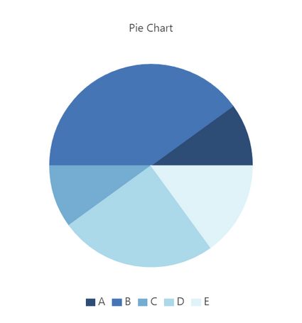
This pie chart example shows us how to calculate pie chart angles using the circle graph maker. This helps us understand how to make a pie chart.
How do I calculate the percentage for pie chart?
In order to understand how to calculate the percentage for a pie chart, we'd do the following:
- Find the sum of all values across all segments of data.
- Divide the value of each segment by the total to get the decimal value.
- Convert the decimal to a percentage by multiplying it by
100%💯!
If, for example, the data has only two kinds of segments, each with half of the total values, then each of these segments will be represented as semicircles in the pie chart, since each one constitutes 50% of the total.
FAQs
How do I calculate the angles for a pie chart?
To calculate the central angle in the circle graph, we must multiply each percentage by 360°. Once we calculate this angle in the circle graph, we can mark a sector with that angle to indicate the portion of the pie chart corresponding to that data segment.
How do I calculate probability in pie chart?
The circle graph maker uses percentages to calculate the central angle of each sector in the pie chart. Using these percentages, we can find the probability of each data segment by simply converting it to a decimal value! For example, if a segment of data occupies a sector that's 40% of the entire pie chart, the probability of that segment of data will be 0.4.
What is a 75-25 pie chart?
While calculating a pie graph with 2 segments of data, if we get 75% for one data segment and the remaining 25% for the other data segment, we will end up with a 75-25 pie chart, where three quarters will represent one segment. In contrast, one quarter will represent the other segment. The 75-25 pie chart means that the pie chart is divided in the ratio 75:25 or 3:1 between the two segments.
What is 15 percent in a pie chart?
To know what 15 percent is in a pie chart, we'd do the following:
- We must multiply 15% with 360°.
- On doing that, we'll get 54°.
- This means that if we have a data segment with 15 percent of the total values, the pie graph maker will represent it as a sector with a central angle of 54°.
What is 45% in a pie chart?
It's a sector with a central angle of 162°. To know what 45% is in a pie chart, we'd do the following:
- We must multiply the percentage with 360°.
- On doing that, we'll get 162°.
- This means that the pie graph maker will represent it as a sector that's a bit smaller than a semicircle.
How do we represent 5 percent of 420 in a pie chart?
Five percent of 420 is 21. To visualize this in a pie chart, we'll find 5% of 360°, which will give us 18°. This result means that for a data segment constituting 5 percent of 420 (or the total), the circle chart generator will represent it using a sector with a central angle of 18°.