Box Plot Calculator
Welcome to Omni's box plot calculator — your everyday box-and-whisker plot maker. A box plot is perhaps the most common way of visualizing a dataset without listing the individual values. It uses the so-called five-number summary, which describes the entries' distribution on the number line. And, if none of that fancy terminology tells you anything, don't worry! We'll see what a box plot is shortly and explain how to read a box-and-whisker plot. And for those not-so-new to statistics, we'll introduce the modified box plot that separates the outliers from the box-and-whisker plot.
What is a box plot?
A box plot (often expanded to a box-and-whisker plot) represents a dataset's distribution. It is most often used to analyze large sequences of numbers where we don't care much about what the individual values are but would rather see where most of them fall and how far from that the extreme values are.
Let's look at a box-and-whisker plot example and explain its components.
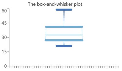
In essence, the five horizontal lines are all there is to it. The bunch is called the five-number summary of a dataset, and sure enough, Omni's box-and-whisker plot maker provides their values together with the graph itself. It's time to learn what they are from top to bottom.
-
The maximum
Simple enough: it's the largest entry in the dataset. On the graph, it's the top dark blue line.
-
The third quartile
A quartile is one-fourth of the dataset. As such, the third quartile marks the end of the range in which three-fourths of the entries lie. Formula-wise, it's the median of the top half of the values. On the plot, it's the top side of the box.
-
The median
It marks the middle of the dataset. It's not the same as the mean, mind you! Instead, it says that half of the entries are larger and the other half are smaller than the median. In the picture, it's the light blue line in the middle.
-
The first quartile
Similar to its equivalent from point 2., it marks the end of the range in which one-fourth of the values lie. Together with the third quartile, it forms the interquartile range, i.e., the box on the box-and-whisker plot example above, which shows where roughly half of the entries are. On the graph, it's the bottom side of the box.
-
The minimum
The opposite of the maximum: it marks the smallest entry of the dataset. On the plot, it's the bottom dark blue line.
Alright, now that we know what a box plot is and can identify its components, it's time to see how to make a box-and-whisker plot in practice. For now, we'll focus on general instructions and formulas, which we then apply to a numerical example in the dedicated section. What is more, we'll also go through the whole thing the other way round, i.e., explain how to read a box-and-whisker plot.
As you can see, several statistical notions are involved here. If you're not familiar with any of them, make sure to visit our dedicated calculator to learn more!
How to make a box-and-whisker plot
As mentioned in the above section, the box-and-whisker plot calculator is basically a tool to visualize five values associated with a dataset. Therefore, explaining how to find them seems like a reasonable thing to begin with, don't you think?
Say that you have a sequence of numbers . For simplicity, let's assume that they are listed from least to most. If they weren't, we'd have to order them before we do anything else. Also, note that below, the subsequent steps on how to make a box-and-whisker plot are in a different order to those in the above section. That is because it's usually easier to calculate the five numbers in the order given below.
-
The maximum
That's the largest of the numbers. In our case, the entries are ordered, so we have .
-
The minimum
The smallest of the numbers. In the ordered sequence, it is .
-
The median
That one's a bit trickier. We need to find the value with the same number of entries to the left (i.e., smaller) and to the right (i.e., larger). If is odd, there is indeed such an entry, and we have . On the other hand, if is even, we need to take the average of the two middle numbers, i.e., .
-
The first quartile
It's the median of the lower half of the entries. However, we again have to take 's parity into account. To be precise, if is even, the sequence splits nicely into halves, so there's no problem: we find the median of the lower half. On the other hand, if is odd, i.e., when , then the first quartile is the median of all the entries from up to and including .
-
The third quartile
The median of the upper half of the entries. We compute it the same way as the first quartile, but we take the other half. For odd, we take those from up until (i.e., the number appears in both the calculations).
Once we have the five values, we can get the crayons ready: it's drawing time!
To graph a box plot, we begin with the box itself. We mark the first and third quartiles on the line (note how Omni's box-and-whisker plot calculator draws the thing vertically with the scale to the left, but at times, you may come across a horizontal version) and draw a rectangle whose two opposite sides correspond to those values (the rectangle's width doesn't matter). Next, we mark the median by a line inside the rectangle that is parallel to the quartiles. With that, we have the box part done.
Now for the whiskers. We look for the maximum and minimum on the scale and draw lines in the corresponding places, again parallel to the quartiles. Once that's done, we connect their midpoints to the box's sides marking the third and first quartiles, respectively.
Voilà! When you finish the last step, you can proclaim yourself a box-and-whisker plot maker, and the graph is ready!
How to read a box-and-whisker plot
Suppose that you are given you a box-and-whisker plot example and want to say something about the underlying dataset without knowing the entries themselves. This section tells you precisely how to do it.
We'll explain how to read a box-and-whisker plot by listing the information it provides in no particular order. For reference, we give the same example as the first section.
- The five horizontal lines on the graph mark the five-number summary of the dataset. From the top, they are: the maximum, third quartile, median, first quartile, and minimum.
- The two limit lines are the dataset's extrema. In other words, all entries of the dataset (no matter how many there are) fall somewhere between the two values.
- The box marks the interquartile range. To be precise, it's where around half of the entries are.
- The line going through the middle of the box is the median. You can think of it as the middle of the dataset: half of the entries are larger and the other half smaller. However, it is not the same as the mean.
- If the box is "thin," the dataset is not spread too much. In particular, in that case, there may be many repetitions similar or equal to the median.
- If the whiskers (i.e., the lines connecting the box to the minimum and maximum) are long, then the extreme values are very different from most of the dataset. In fact, they may be the box-and-whisker plot's outliers, so you might want to look at the modified box plot instead (see the dedicated section for more information).
Quite a lot, wouldn't you say? It's almost as if we're able to get to know the dataset without knowing it inside out.
Still, as suggested in the last point, there's a way we can improve our dataset analysis in extreme cases. We've learned what a box plot is, so we're ready to study its older brother: the modified box plot (obviously, also available in Omni's box plot calculator).
The modified box plot
Sometimes a dataset has a few entries that greatly differ from the rest. For instance, there may be one particularly good student that got a much better grade on a test than the rest of the class. If you're not that person, your parents may then complain that you're not studying as hard as the other guy. In that case, you can use the modified box plot to show them you're trying as much as anyone else and that the one person is surely an alien or something.
The modified version of the box plot separates the so-called outliers from the rest of the dataset. To be precise, it's just the regular graph as explained in the first section, but obtained only from the non-outliers, i.e., we don't take the values that are inexplicably large or unusually small. Still, we don't forget about those quirky guys: the box-and-whisker plot's outliers are still in the picture as individual points, just beyond the whiskers.
Suppose that Q1 and Q3 are the first and third quartile of the whole dataset, respectively (outliers or not). Denote the the interquartile range by IQR = Q3 - Q1 .
💡 An outlier is an entry x that satisfies one of the following inequalities: x < Q1 - 1.5 × IQR or x > Q3 + 1.5 × IQR. Learn more with our outlier calculator. To discover what IQR is, go straight to the IQR calculator.
In other words, drawing a modified box plot is a multi-layered process. First of all, we need to find the quartiles of all the entries and check if there are any outliers. If yes, we take them away and follow the usual instructions from the second section but for the reduced dataset. Note that this now means calculating the quartiles again because the dataset is now different.
Alright, enough theory for today! It's high time we use our acquired knowledge and used Omni's box plot calculator with some numeric data.
Example: using the box plot calculator
Suppose that you're a high school PE teacher, and one day you decided to test your students with the 100-meter dash. Everyone in your call of twenty people takes their turn to sprint the distance while you note their times. They are:
13.2s, 14.1s, 11.9s, 15.2s, 14.5s, 12.9s, 12.7s, 14.1s, 18.3s, 15.6s, 14.5s, 13.8s, 12.9s, 13.3s, 13.9s, 16.6s, 15s, 14.2s, 17.4s, 16.2s.
Apart from grading the students, you decide to analyze the performance of the class as a whole. And what better way to do that than to draw the box-and-whisker plot?
First of all, we'll see how easy the task is with Omni's box plot calculator at hand. There, at the top, we can choose between the regular and the modified version. We don't need the fancy one here, so we simply choose "I'd like to see the regular box plot."
Next, we input the data. Note, that while there are only eight fields visible at first, but new ones appear once you begin giving the entries (in total, you can input up to thirty values). Also, observe how the box plot calculator already shows the answer for two numbers and adjusts the result and the graph with every consecutive entry. Once we input the last one, we can scroll underneath to view the five-number summary of our dataset and the associated box-and-whisker plot.
Now, let's see how to make the box-and-whisker plot ourselves, i.e., without the help of the box plot calculator. According to the instructions from the dedicated section, we begin by ordering the entries. In other words, instead of the sequence above, we'll be working with
11.9s, 12.7s, 12.9s, 12.9s, 13.2s, 13.3s, 13.8s, 13.9s, 14.1s, 14.1s, 14.2s, 14.5s, 14.5s, 15s, 15.2s, 15.6s, 16.2s, 16.6s, 17.4s, 18.3s.
From that, we can already identify
minimum = 11.9s and maximum = 18.3s.
Secondly, we look for the median. We have twenty entries (an even number), so it will be the arithmetic mean) of the 10th and 11th values, i.e.,
median = (14.1s + 14.2s) / 2 = 14.15s.
Next, we need the quartiles, i.e., the medians of the first and second half of the dataset. Each contains 20 / 2 = 10 entries (again an even number), so they will again be the arithmetic means: of the 5th and 6th entries for the first quartile and 15th and 16th entries for the third.
Q1 = (13.2s + 13.3s) / 2 = 13.25s,
Q3 = (15.2s + 15.6s) / 2 = 15.4s.
With that, we have all the components of a box-and-whisker plot, so we can draw the visual representation of our dataset:
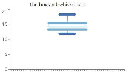
We see that, in general, the results didn't differ too much between the students. Still, we have a high maximum, so maybe it'd be a good idea to encourage that person to do more sports?
FAQ
How do I make a box-and-whisker plot?
To make a box-and-whisker plot, you need to:
-
Order the dataset from least to greatest.
-
Identify the minimum (the first ordered entry).
-
Identify the maximum (the last ordered entry).
-
Find the median of the whole dataset.
-
Find the first quartile, i.e., the median of the bottom half of the entries.
-
Find the third quartile, i.e., the median of the upper half of the entries.
-
Graph the box-and-whisker plot by drawing:
- A box with two sides at the values from points 5-6.;
- A line through the box at the value from point 4.;
- Lines parallel to the above line at the values of points 2-3.;
- A line connecting points 2. and 5.; and
- A line connecting points 3. and 6.
How do I read a box-and-whisker plot?
You can read the following information from a box-and-whisker plot:
- The horizontal lines on the plot correspond to the five-number summary;
- The top and bottom lines are, respectively, the maximum and minimum;
- The box corresponds to the interquartile range;
- The line through the box corresponds to the median;
- The dataset's entries fall between the top and bottom line; and
- Around half of the values are inside the interquartile range.
Where is the mean on a box plot?
Omni's box plot calculator doesn't display the mean, but some sources add it to the graph using a dot, plus, or diamond. We can then compare it to the median to analyze the skewness of the dataset.
How do I find the interquartile range of a box plot?
To find the interquartile range of a box plot, you need to:
- Read off the value of the box's top side.
- Read off the value of the bottom side.
- Subtract the number from point 2. from that given in 1.
- Enjoy having found the interquartile range of your box plot.
How do I make a modified box plot?
To make a modified box plot, you need to:
-
Order the dataset from least to greatest.
-
Find the first and third quartiles.
-
Compute the interquartile range
IQR. -
Based on the
IQR, check if there are any outliers. -
Write the dataset without the outliers.
-
Find the five-number summary of the reduced dataset.
-
Draw the regular box-and-whisker plot of the reduced dataset.
-
If there were any, mark the outliers as single points.